
Introduction to HTML Picture Tag
The front-end developers use HTML picture tag to specify more than one file source to be displayed on a web page depending upon the preference like viewport. This tag allows web developers in the responsive web pages to specify the multiple-image sources and select an image automatically depending upon the viewport so that the web page will be filled perfectly with the source. We can specify multiple sources in the picture tag, and the web page will load the image which satisfies the preference. The picture tag is introduced with HTML 5.
Syntax:
The picture tag in HTML contains two types of tags in it, the first type is <source> which allows specifying the source of files, and the second is <img> tag which allows specifying an image to be displayed in case of a browser does not support the <picture> tag. The syntax of the <picture> tag is as below,
<picture>
<source . . . >
.
.
<source . . . >
<img . . . >
</picture>
The picture tag will always have a closing tag with the two types of tags in it, as mentioned. The <src> tag will come multiple times depending upon the number of resources, and there will be only one <img> tag. The source and image tag will have different attributes that will determine the functionality of a picture tag.
Attributes of HTML Picture Tag
As mentioned, the picture tag holds the other two tags <source> and <img>. The attributes applicable to these two tags will apply to the picture tag.
1. src
This attribute is used along with the <img> tag. This attribute allows specifying the path or URL of the image to be displayed. This field is required and needs to specified whenever a source tag is used. In this way, we can specify multiple sources for images.
2. srcset
This attribute can be used with <source> or <img> tags and is new in HTML 5. This attribute is similar to the previous “src” attribute, but it allows us to define some more values. This attribute takes two values as input, first is the path or URL of a file, and second is either a width descriptor of an image like (100w) or a pixel density descriptor of an image like (3x); each is followed by w and x respectively.
3. media
This attribute is used along with the <source> tag. This tag allows us to define the rules on which the image to be displayed. This attribute takes any media query as an input and applies the rule. The media query can be checking the viewport or device size or height, etc.
In this way, we can achieve a responsive design using this attribute and tag along with the <picture> tag.
4. sizes
This attribute can be used with <source> and <img> tags. As the image will be displayed with default width, this attribute allows us to specify an image’s width explicitly depending upon the media condition. The media condition is a simple condition like “max-width: 800px” without any additional parameters. The picture tag will always have a closing tag with the two types of tags in it, as mentioned. The <src> tag will come multiple times depending upon the number of resources, and there will be only one <img> tag. The source and image tag will have different attributes that will determine the functionality of a picture tag. The size attribute can accept more than one media condition like this. This is very useful in responsive web designing, where we can set the conditions and display images accordingly.
5. type
This attribute is used along with the <source> tag. This attribute allows us to explicitly specify the MIME type of the file to be displayed.
Examples of HTML Picture Tag
HTML is used to give web developers the flexibility to define image resources. Below are the examples of HTML Picture Tag:
Example #1
Code:
<!DOCTYPE html>
<html>
<head>
<meta name = "viewport" content=
"width = device-width, initial-scale = 1.0">
<title>
picture tag in HTML
</title>
<style>
.results {
border : green 1px solid;
background-color : aliceblue;
text-align : left;
padding-left : 20px;
height : 300px;
width : 95%;
}
.resultText {
font-size : 20px;
font-style : normal;
color : blue;
}
</style>
</head>
<body>
<div class = "results">
<h2> picture tag in HTML </h2>
<span> Resize the browser to see the effect.. </span>
<div class = "resultText">
<picture>
<source media = "(min-width: 550px)" srcset = "https://cdn.educba.com/triangle.png" >
<source media = "(min-width: 465px)" srcset = "https://cdn.educba.com/rectangle.png" >
<img src = "circle.png" alt="circle" style = "width:auto;" >
</picture>
</div>
</div>
</body>
</html>
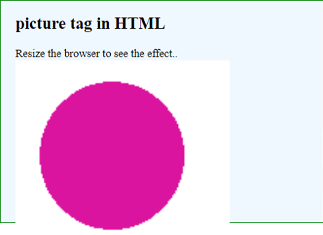
Output:
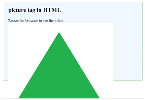
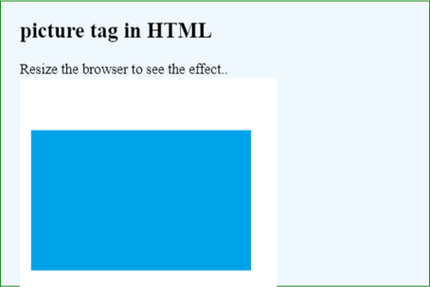
Here we have three images with different resolutions.

In code, we have specified the min-width media query to display an image. After running the code, try to resize the browser size, and different images will be displayed depending on the width. Popular Course in this categoryHTML Training (12 Courses, 19+ Projects, 4 Quizzes)12 Online Courses | 19 Hands-on Projects | 89+ Hours | Verifiable Certificate of Completion | Lifetime Access | | 4 Quizzes with Solutions
4.5 (6,502 ratings)Course Price
₹6999 ₹41999
View Course
Related CoursesBootstrap Training (2 Courses, 6+ Projects)XML Training (5 Courses, 6+ Projects)CSS Training (9 Courses, 9+ Projects)
For Width Greater than 550 px:
For Width Greater than 465 px:
For Other Cases, i.e. width less than 465px:
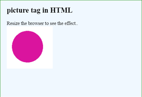
Note, the outer border of the images clarifies the resolution of images. In most of the cases, all these images will be the same but with different resolutions.
Example #2
Code:
<!DOCTYPE html>
<html>
<head>
<meta name = "viewport" content=
"width = device-width, initial-scale = 1.0">
<title>
picture tag in HTML
</title>
<style>
.results {
border : green 1px solid;
background-color : aliceblue;
text-align : left;
padding-left : 20px;
height : 300px;
width : 95%;
}
.resultText {
font-size : 20px;
font-style : normal;
color : blue;
}
.img {
max-width: 100%;
}
</style>
</head>
<body>
<div class = "results">
<h2> picture tag in HTML </h2>
<span> Resize the browser to see the effect.. </span>
<div class = "resultText">
<picture>
<source media = "(min-width: 550px)" srcset = "https://cdn.educba.com/triangle.png" >
<source media = "(min-width: 465px)" srcset = "https://cdn.educba.com/rectangle.png" >
<img src = "circle.png" alt="circle" srcset="https://cdn.educba.com/circle.png 2000w" sizes = "900vw" style = "width:auto;">
</picture>
</div>
</div>
</body>
</html>
Output:
Here, we have used the attribute size with the <img> tag. The maximum width of an image is limited by using CSS first, but these sizes attribute, along with srcset, forces to use the width depending on the size specified in terms of the viewport.
Conclusion
Web developers use HTML picture tag in responsive web page designing. This tag consists of two child tags source and img. Using different attributes available for these tags makes it possible to display images dynamically depending on the conditions.
Recommended Articles
This is a guide to the HTML Picture Tag. Here we discuss the Attributes of HTML Picture Tag like src, srcset, media, etc. and its Examples along with Code Implementation. You may also have a look at the following articles to learn more –