Introduction to Scrollbar Color
A scroll bar is a movable bar, generally located at the very right or at the bottom of your screen. A scroll bar is either horizontally mounted or vertically, allowing the user to move the window up and down or right and left. In other words, the scroll bar is a widget or a technique that creates an interaction between the user and the system window display, which scrolls a continuous picture or a text or any kind of display. The scroll bar contains a ‘BAR’ or commonly known as ‘TRACK’, and this bar has a ‘THUMB’ that is used to move the window contents, up and down or right and left. In this topic, we are going to learn about Scrollbar Color.
Generally, the scroll bar you find is usually block-shaped and gray in color. But the default color and other properties of the scroll bars can be manipulated and customized using CSS or JavaScript, or both.
In the coming sections, we will try and create scroll bars manipulated using CSS and Javascript.
Customization of Scrollbar Color
The color property simply helps to set a different color, other than default gray for the ‘thumb’ and the usual track color. We all know that the background area color for the scroll bar ( which is generally fixed no matter in which direction the user scrolls ) is known as the ‘TRACK’. And the moving part, which actually scrolls along with the scrolling window, it floats on the track, is called the ‘THUMB’.
Below is a visual example figure explaining the track and the thumb.
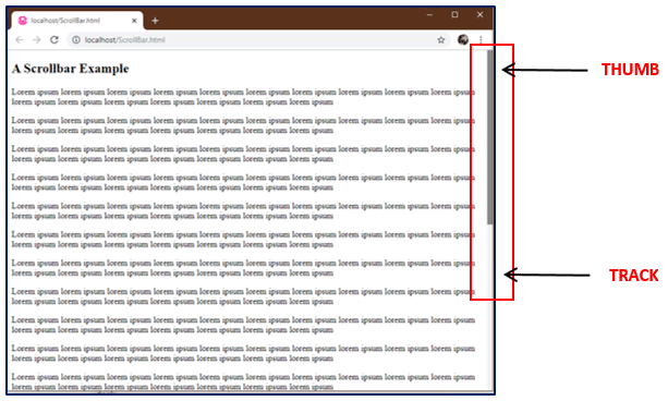
The above image is a simple representation of a web page with overflowed information. The user has to click on the thumb and drag it in the up and down direction to view the complete information. Popular Course in this categoryHTML Training (12 Courses, 19+ Projects, 4 Quizzes)12 Online Courses | 19 Hands-on Projects | 89+ Hours | Verifiable Certificate of Completion | Lifetime Access | | 4 Quizzes with Solutions
4.5 (6,502 ratings)Course Price
₹6999 ₹41999
View Course
Related CoursesBootstrap Training (2 Courses, 6+ Projects)XML Training (5 Courses, 6+ Projects)CSS Training (9 Courses, 9+ Projects)
The Scroll Bar that can be seen in the above image is a Default Browser-based Scroll Bar with its default values. We keep talking about default values; let’s see them as well.
- <scrollbar-color>: Defines the color of your scroll bar and the default values it carries as below:
- auto: ‘auto’ is the default property for the track of the scroll bar if the programmer has not given any specific color or property.
- dark: ‘dark’ property, when provided, shows a dark scroll bar that can be one of the darker shades of the color provided by your browser or platform or the darker shade of the color defined by you.
- light: ‘light’ property shows the lighter shade of the platform provided color or the color you set for the scroll bar.
- <color,color>: The first color signifies the color for the scroll bar’s thumb, and the second color represents the color for the track.
The <scrollbar-color> property drawback is limited and only supported on browsers with a specific version and above. For example, the property is supported by Chrome at version 81 and above, similarly Firefox at 72 and above, and so on. To avoid this, we use another property called the ‘-webkit-’ properties.
The browsers such as Opera, Chrome, Safari are -webkit- browsers and thus support the non-standard pseudo-element called, “:: -webkit-scrollbar” element, which allows us to make changes to our scroll bar easily irrespective of the browsers.
The properties are set to ‘auto’ by default, which, when manipulated, can create the visuals really interesting. These elements are added at the top of your code (see below) in the <HEAD> section to customize the browser’s default scroll bar properties.
Examples of Scrollbar Color
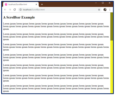
We created the following example of a simple scroll bar with a width of 18 pixels. We gave it a yellow tack color with a leafy green bar or handle color.
<style>
/* width */
::-webkit-scrollbar {
width: 18px;
}
/* Track */
::-webkit-scrollbar-track {
background: #f1f120;
}
/* Handle */
::-webkit-scrollbar-thumb {
background: #881;
}
</style>
One more property can be added to the bar or handle, ‘::-webkit-scrollbar-thumb:hover’, which helps you set a different color to your scroll bar when it has hovered over.
To add a ‘hover over’ property to our bar or handle, we just need to add the following code lines to our script;
/* Handle on hover */
::-webkit-scrollbar-thumb:hover {
background: #520;
}
And the result can be seen in the below screenshot:
Our leafy-green colored bar changed to Brown when hovered over.
Let’s see another example of exploring more properties. In the following example, we smoothed out our bar and the thumb using the border radius property. The interesting thing is to create buttons for users to easily move the bar on the track by clicking on the buttons instead of dragging the bar.
We have added the below code for creating our own custom button:
/* Custom Button */
::-webkit-scrollbar-button:single-button {
background-color:none;
display: block;
border-style: solid;
height: 13px;
width: 16px;
}
The above will simply display the area with a border where our buttons will appear, as shown below. This will need some customization as well.
After our customization (see the code added) is done, we get the final result. See the results for yourselves:

Complete code is given below:
<head>
<style>
/* Custom width for the Scrollbar */
::-webkit-scrollbar {
width: 18px;
}
/* Custom Track */
::-webkit-scrollbar-track {
box-shadow: inset 0 0 5px grey;
border-radius: 10px;
background: #f1f120;
}
/* Handle */
::-webkit-scrollbar-thumb {
background: #881;
border-radius: 10px;
}
/* Handle on hover */
::-webkit-scrollbar-thumb:hover {
background: #520;
}
/* Custom Button */
::-webkit-scrollbar-button:single-button {
background-color:none;
display: block;
border-style: solid;
height: 13px;
width: 16px;
}
/* Custom Up Direction Button */
::-webkit-scrollbar-button:single-button:vertical:decrement {
border-width: 0px 8px 9px 8px;
border-color: transparent #881;
border-radius: 10px;
}
/* Custom Down Direction Button */
::-webkit-scrollbar-button:single-button:vertical:increment {
border-width: 0px 8px 9px 8px;
border-color: transparent #881;
border-radius: 10px;
}
</style>
</head>
SimpleBar: A JavaScript Library
There is always another way to implement elements in your project. A custom scroll bar can also be added with the help of jquery plugins and javascript libraries, popular in the web market. For example, SimpleBar is the new Javascript library that makes it easier for the author to create customized scrollbars.
It’s a standalone library that adds a scroll bar to any scrollable element or component, or container which might have overflowing content. This javascript library makes your content dynamic and keeps the native scroll behavior. A simple demo is shown below.
Customization
You can easily use these javascript libraries by installing and importing them into your projects or directly including them and their CSS files (if any) on to your HTML page. In the below example, we will be using the second option, directly including a javascript library into our program.
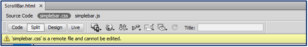
<link rel="stylesheet" href="https://unpkg.com/simplebar@latest/dist/simplebar.css" />
<script src="https://unpkg.com/simplebar@latest/dist/simplebar.js"></script>
Adding these two lines to your HTML page will include and attach a remote file that can not be edited to your HTML like this;
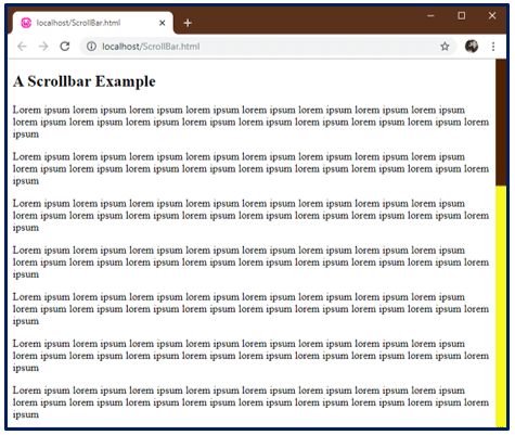
Next, we will add, ‘data-simplebar’ attribute to the division or the content, which will be the scrollable container of your HTML page. In our example, we added this attribute to the <body> tag itself. Along with this, we will require a sample text; I have added ‘Lorem Ipsum’ default text to our <body> tag to make the web page scrollable.
And that is it. Simple right? When this is all done, your web page will look like this –>
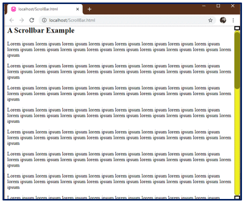
But it’s still raw and a bit ugly. I have done a few tweaks, as shown below, and see the results for your selves. The full code for CSS is given below, along with the results.
<style>
:root {  --primary: #212123;
}
body, html{          height: 100vh;
}
body{      background: var(--primary);
font-family:Georgia, "Times New Roman", Times, serif;
color: #fff;
display:grid;
grid-columns:60% auto;
margin: 0;
}
p{                            margin: 1em;
padding: 1em;
background-color: #333;
border-radius:10px;
color: #99F;
}
h2 {         color: #996;
}
.simplebar-scrollbar:before{background-color:#0F0;
}
.simplebar-scrollbar{margin-right:3px;
}
</style>
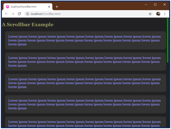
And the result is, as you can see below;
You can manually configure the javascript libraries as well, but then you need to initialize them first and then configure them; an option is known as ‘override’ is used, passing the object as a parameter of our Simplebar Function.
You can design it as you want since this library is lightweight. It has a simplebar.js file, a vanilla javascript custom scroll bar plugin that ensures great performance and works with all browsers.
Recommended Articles
This is a guide to Scrollbar Color. Here we discuss the creation of scroll bars manipulated using CSS and Javascript along with the examples. You may also have a look at the following articles to learn more –