
Introduction to HTML Tooltip
Tooltip is a concept used in HTML for showing some extra information about the specifically selected element. This can be done on the mouse hover effect whenever the user moves the mouse over an element that is using a tooltip to display specified information about that element.
It is used as an inline element like span, sometimes with class tooltip text. One can set a position to that tool tipped text by using CSS, which helps us to define some style and position to our tooltip. Using a tooltip to our WebPages is helps us do more interaction with the user because it gives short information of included elements.
Syntax
HTML uses a method that defines tooltip by using the link with a title attribute. It can define as follows:
<a href=”” title=”tooltip_text”> Content </a>
As shown in the above syntax, the text displayed in the title attribute is considered as tool tipped text. So users can click this link to see more information about it.
The title is considered as a global attribute, so it allows the user to easily add it to the element, which is as simple as adding a class or id to the element. With the help of that, one can add simply anything means paragraph, div block, which is containing whole column and many more things. Basically, a tooltip is shown top of the element. One can put their tooltip at the position like top, bottom, left or right. This position to their tooltip by using some value defined in CSS.
How to Add Tooltip in HTML?
Tooltip can be added to the element in HTML. It uses elements like div, paragraph and many others also. Whenever a mouse gets hovers on that specific attribute, it will show text or other information known as a tooltip. It can be displayed at right, left, top or bottom at any position of the text. This is as follows: Popular Course in this categoryHTML Training (12 Courses, 19+ Projects, 4 Quizzes)12 Online Courses | 19 Hands-on Projects | 89+ Hours | Verifiable Certificate of Completion | Lifetime Access | | 4 Quizzes with Solutions
4.5 (6,502 ratings)Course Price
₹6999 ₹41999
View Course
Related CoursesBootstrap Training (2 Courses, 6+ Projects)XML Training (5 Courses, 6+ Projects)CSS Training (9 Courses, 9+ Projects)
1. Top Position
In this position, a tooltip will be displayed at the top of the element.
Code:
.tooltip.tooltiptext{
width: 160px;
bottom:80%;
left:40%;
margin-left: 80px;
}
2. Right Position
This tooltip code will tooltip be displayed on the right side of the element.
Code:
.tooltip.tooltiptext{
top:4px;
left:100%;
}
3. Left Position
This tooltip code will tooltip be displayed on the left side of the element.
Code:
.tooltip.tooltiptext{
top:4px;
right:100%;
}
4. Bottom Position
In this position, the tooltip will be displayed at the bottom of the element.
Code:
.tooltip.tooltiptext{
width: 160px;
top:100%;
left:40%;
margin-left: 80px;
}
One can also be able to display an arrowed tooltip to the element by using this tooltip feature defined in it. HTML tooltip helps to open the linked webpage, related documents or image also. We can display that using tooltip is displaying tooltip with fade in just like an animation effect. We can do this by using code as follows:
Code:
.tooltip.tooltiptext{
opacity:0;
transition: opacity 5s;
}
.tooltip:hover.tooltiptext{
opacity:0;
We can do the most important thing by using a tooltip to open a modal box by clicking a single tooltip. This type of code is mostly used whenever needed to open some kind of forms or other details by using a simple link. This is treated as the simplest way to open modal with minimum code.
Examples of HTML Tooltip
Below are the examples of HTML tooltip:
Example #1
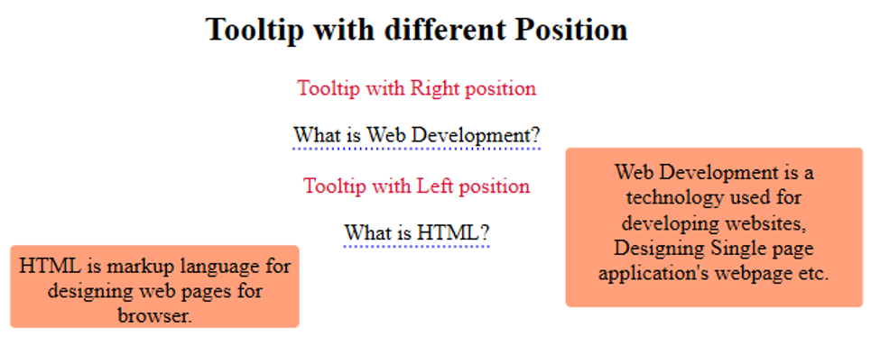
This is one example of showing the position of a tooltip with Right and Left value.
HTML Code:
<!DOCTYPE html>
<html>
<style>
/*right position*/
.tooltipright{
position: relative;
display: inline-block;
border-bottom: 2px dotted blue;
}
.tooltipright .toolttext {
visibility: hidden;
width: 200px;
height:100px;
background-color:lightsalmon;
color: black;
text-align: center;
border-radius: 4px;
padding: 8px ;
/* Position the tooltip */
position: absolute;
z-index: 0;
left: 110%;
}
.tooltipright .toolttext {
visibility: visible;
}
/*left position*/
.tooltipleft{
position: relative;
display: inline-block;
border-bottom: 2px dotted blue;
}
.tooltipleft .toolttextleft {
visibility: hidden;
width: 200px;
height:50px;
background-color:lightsalmon;
color: black;
text-align: center;
border-radius: 4px;
padding: 5px ;
/* Position the tooltip */
position: absolute;
z-index: 1;
right: 130%;
}
.tooltipleft:hover .toolttextleft {
visibility: visible;
}
</style>
<body style="text-align:center;">
<h2>Tooltip with different Position</h2>
<p style="color :crimson;">Tooltip with Right position</p>
<div class="tooltipright">What is Web Development?
<span class="toolttext">Web Development is a technology used for developing websites, Designing Single page application's webpage etc.</span>
</div>
<br>
<p style="color :crimson;">Tooltip with Left position</p>
<div class="tooltipleft">What is HTML?
<span class="toolttextleft">HTML is markup language for designing web pages for browser. </span>
</div>
</body>
</html>
Output:
Example #2
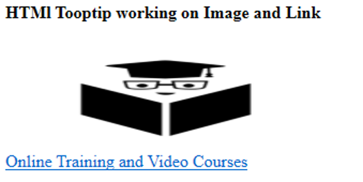
This example illustrates that we can use tooltip on some links as well as for images also. So whenever the user hovers the mouse on it, this will display information or clickable link to open another webpage or document.
HTML Code:
<html>
<head>
<title>HTML tooltip</title>
</head>
<body>
<h4>HTMl Tooptip working on Image and Link</h4>
<img src="../Desktop/EDUCBA.png" title="EDUCBA"/
style="height:100px;     width:300px;">
<br/>
<a href="https://www.educba.com/" title="All About EDUCBA.">
Online Training and Video Courses</a>
</body>
</html>
Output:
Whenever the user is clicking on a given link, it will show a linked webpage as follows:

Example #3
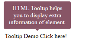
Whenever we want to display a popup on hover or click on specific elements, then a tooltip is the best option to handle this thing easily.
HTML Code:
<html>
<head>
<title>HTML tooltip</title>
</head>
<style>
.arrowpopup {
position: relative;
display: inline-block;
cursor: pointer;
}
.arrowpopup .tooltiptext {
visibility: hidden;
width: 160px;
background-color: #856;
color: white;
text-align: center;
border-radius: 4px;
padding: 9px ;
position: absolute;
bottom: 150%;
left: 50%;
margin-left: -85px;
}
.arrowpopup .tooltiptext::after {
content: "";
position: absolute;
top: 100%;
left: 50%;
margin-left: -5px;
border-width: 5px;
border-style: solid;
border-color: #856 transparent transparent transparent;
}
.arrowpopup .show {
visibility: visible;
}
</style>
<body style="padding:100px;">
<div class="arrowpopup" onclick="myFunction()">Tooltip Demo Click here!
<span class="tooltiptext" id="tooltipdemo">HTML Tooltip helps you to display extra information of element.</span>
</div>
<script>
function myFunction() {
var tt = document.getElementById("tooltipdemo");
tt.classList.toggle("show");
}
</script>
</body>
</html>
Output:
Conclusion
From all the above information, we realised that Tooltip is a feature in HTML used to show some related information or short descriptions of a selected element. As per the user’s choice, they can decide where this tooltip should appear as respective to the element. Position value will be right, left, top or bottom.
Recommended Articles
This is a guide to HTML Tooltip. Here we discuss the introduction, add tooltip in HTML, and examples in HTML and outputs. You can also go through our other suggested articles to learn more –