
Introduction to Responsive in HTML
Responsive design in HTML is the concept that fits the HTML element according to device size for every screen size. Those elements should look perfect in every device like mobile, desktop or tablet. Responsive design is the thing in which element gets quickly adjust as per available space in the display view. It based on things like viewport width, text size, responsive image, and other elements. Nowadays, there are many new techniques involved in responsive designing term to perfect suits design with different browsers as well as devices. Media queries are one of the best parts, including in responsive design trough CSS, which tells the browser to get adjusted as per their user’s device size.
Syntax Used in HTML Responsive Design
Responsive design in HTML is dependent upon so many factors; let’s see them one by one:
1. Setting Viewport: Below’s Syntax is used to set the viewport to the user page view, which helps the browser control the dimensions of the web page and its scaling. It will automatically adjust elements as per different device sizes and display screens as per the device.
<meta name="viewport" content="width=device-width, initial-scale=1.0">
2. Responsive Images: Whenever adding some images to our web page, it is also necessary to display those images in the proper size on each device’s screen size.
<div class='section content'> <img class='example' src='images/example.svg' /></div>
3. Set Width Property: With the help of CSS, we can set the width to 100%, so it helps to make the element responsive in the screen display view.
width: 100%;
4. Using Max Width Property: same as the width, one can set the max-width of the element to 100 %, so it will help us display all our HTML elements in the proper responsive format.
Max-width:100%;
5. Responsive Text: Same as another element, it is necessary to make text also responsible in all devices as per their screen size. It can be set by using VW, which helps the user set the viewport width to adjust the text size as per the device screen easily. This syntax explains that viewport is referred to as the browser display size. Here 1 VW is equal to the actual 1 % of the viewport width. Popular Course in this categoryHTML Training (12 Courses, 19+ Projects, 4 Quizzes)12 Online Courses | 19 Hands-on Projects | 89+ Hours | Verifiable Certificate of Completion | Lifetime Access | | 4 Quizzes with Solutions
4.5 (6,502 ratings)Course Price
₹6999 ₹41999
View Course
Related CoursesBootstrap Training (2 Courses, 6+ Projects)XML Training (5 Courses, 6+ Projects)CSS Training (9 Courses, 9+ Projects)
<h4 style=”font-size:5vw”>Text</h4>
6. Using Media Queries: Media queries play an important in responsive designing to make text, image, and other elements more responsive for different device sizes for different browsers sizes. There are different frameworks available nowadays to make our webpage more responsive. They are like:
- Responsive Stylesheet: this framework helps us to use different stylesheets framework like W3.CSS, which takes the main role while creating a responsive design. By default, it supports to mobile-first design. It is easy to learn & develop.
- Bootstrap: It is the most popular framework that is growing rapidly and available freely to the user. It is more user-friendly than another framework because it’s based on web development languages like HTML, CSS, and jquery, which helps to make web pages more responsive.
- Latest Responsive CSS: It supports various kinds of browsers as well as all types of devices like smartphones, tablets, laptops, etc.
Examples of Implementing Responsive in HTML
Below are the examples of Responsive in HTML.
Example #1
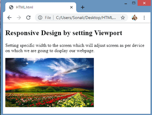
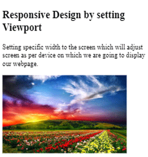
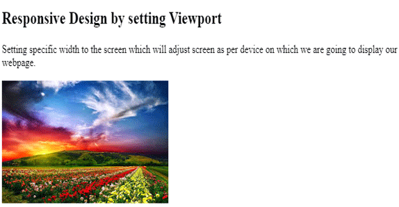
In this example, we are setting viewport in the HTML code and also made the image responsive.
HTML Code:
<meta name="viewport" content="width=device-width, initial-scale=1.0">
<body>
<h2>Responsive Design by setting Viewport</h2>
<p>Setting specific width to the screen which will adjust screen as per device on which we are going to display our webpage.</p>
<img src="images.jpg" >
</body>
Output on Desktop or Laptop Screen:
Output on Mobile Devices:
Output on Tablet:
Example #2
In Example 2, we are making the screen responsive using media queries. That will help us to make webpages responsive by supporting various browsers as well as on various devices too by using code:
HTML Code:
<head>
<meta name="viewport" content="width=device-width, initial-scale=1.0">
<style>
* {
box-sizing:border-box;
}
.top {
background-color:#00ff00;
padding:20px;
float:left;
width:30%;
}
.middle {
background-color:#800000;
padding:20px;
float:left;
width:40%;
color:white;
}
.bottom {
background-color:#00ffff;
padding:20px;
float:right;
width:30%;
}
@media screen and (max-width:800px) {
.top, .middle, .bottom {
width:100%;
}
}
</style>
</head>
<body>
<h2>Responsive Design in HTML using Media Queries</h2>
<p>We will see web page on different devices by resizing browser window</p>
<div class="top">
<h4>First Content Part</h4>
<img src="images.jpg">
</div>
<div class="middle">
<h4>Second Content Part</h4>
<img src="images.jpg">
</div>
<div class="bottom">
<h4>Third Content part</h4>
<img src="images.jpg">
</div>
</body>
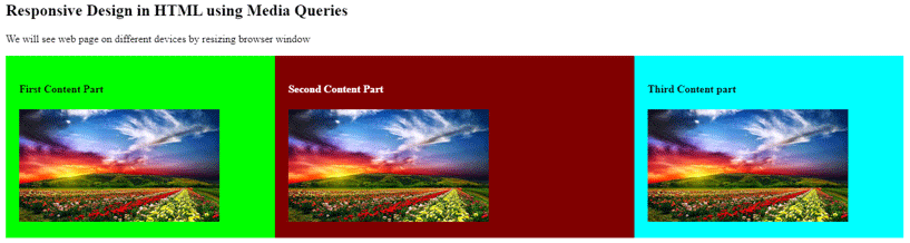
Output on Desktop View:
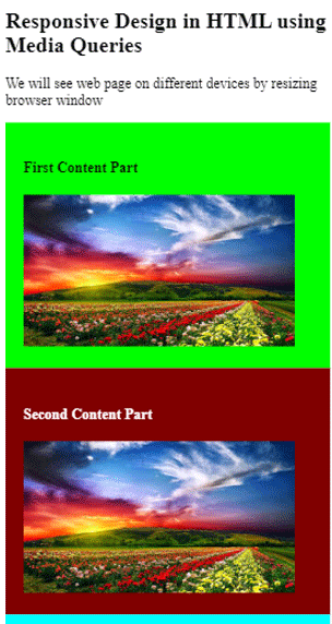
Output on Mobile Devices: Into the mobile device, the output screen will be scrollable so to see the whole webpage, we have to scroll down on the screen.
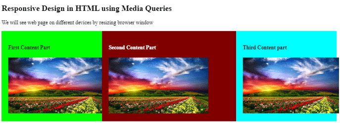
Output on Tablet Device: The same output will be get adjusted as Per Tablet Device Size.
Example #3
Let’s see another Example 3 using bootstrap, Standard CSS and media queries:
HTML Code:
<html>
<head>
<meta name="viewport" content="width=device-width, initial-scale=1.0">
<style>
* {
box-sizing: border-box;
}
.options {
float:left;
width:20%;
text-align:center;
}
.options a {
background-color:#e5e5e5;
padding:8px;
margin-top:7px;
display:block;
width:100%;
color:black;
}
.main {
float:left;
width:60%;
padding:0 20px;
}
.course {
background-color:#ff8000;
color:white;
float:left;
width:20%;
padding:10px;
text-align:center;
}
#header
{
background-color:#003333;
padding:10px;
text-align:center;
color:white;
}
#footer{
background-color:black;
text-align:center;
padding:10px;
margin-top:7px;
color:white;
@media only screen and (max-width:620px) {
/* For mobile phones: */
.options, .main, .course {
width:100%;
}
}
}
</style>
</head>
<body>
<div id="header">
<h1>Welcome to EDUCBA</h1>
</div>
<div style="overflow:auto">
<div class="options">
<a href="#">Home</a>
<a href="#">About</a>
<a href="#">Career</a>
<a href="#">Contact us</a>
</div>
<div class="main">
<h2>WHO IS EDUCBA?</h2>
<p> Learn Graphic designing, Animation, Game Development, Video Editing & more with our Online Certification Courses</p>
</div>
<div class="course">
<h3><b>Courses</b></h3>
<p>Data science</p>
<p>Marketing</p>
<p>Excel</p>
<p>Design</p>
</div>
</div>
<div id="footer">© 2019 - EDUCBA. ALL RIGHTS RESERVED</div>
</body>
</html>
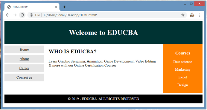
Output on Laptop Screen:
Output on Mobile Devices:

Output on Tablet:

Conclusion
Responsive design is done by using HTML and CSS language to make web page more responsive and user-friendly, which display properly on each and every device size. It uses the latest framework like W3.CSS, bootstrap and some media queries code.
Recommended Articles
This is a guide to Responsive in HTML. Here we discuss the basic concept, Responsive design using HTML and CSS language to make web pages more responsive and user-friendly. You can also go through our other related articles to learn more –