
Introduction to Dropdown List in HTML
The dropdown list in HTML is an important element for form building purposes or for showing the selection list from which the user can select one or multiple values. This kind of selection list in HTML is known as the Dropdown list. It is created using <select> tag with <option> value. It allows the user to choose any option as per their choice. It is always a good practice to use the drop-down list when you know the option value so that one can set any value as a default attribute, and others will be as option values.
Syntax of Dropdown List in HTML
Let’s see how the Dropdown list is going to be created:
Syntax:
<select>
<option value=””>option1</option>
<option value=””>option2</option>
<option value=””>option3</option>
<option value=””>option3</option>
</select>
Example:
<select name=”color”>
<option value=”red”>Red</option>
<option value=”purple”>Purple </option>
</select>
As shown in the above syntax , <select></select> is a tag used to create Dropdown list.<option> tag enclosed in the select tag is an attribute value or attributes for selection list, the value will be for showing whether the option is selected, disabled or with any other properties.option1,2….will be the name. With the help of CSS, we can give effects to our selection list, able to set positions like a relative, absolute, etc., able to set width and do many other functions.
Setting background color or color to the hover by using code:
.dropdown a:hover{
Background-color: color_name;
}
Position for the dropdown list is defined into two values: position: a relative who is used to display the content of the list exactly right below the select list button. With the help of position: absolute;
Min-width is one of the properties used to give a specific width to the Drop Down list. We can set it as long as our drop-down button by setting the width to 100%. The above syntax is defined for single attribute selection; now, we will see how multiple options are going to be selected from the item list. Popular Course in this categoryHTML Training (12 Courses, 19+ Projects, 4 Quizzes)12 Online Courses | 19 Hands-on Projects | 89+ Hours | Verifiable Certificate of Completion | Lifetime Access | | 4 Quizzes with Solutions
4.5 (6,502 ratings)Course Price
₹6999 ₹41999
View Course
Related CoursesBootstrap Training (2 Courses, 6+ Projects)XML Training (5 Courses, 6+ Projects)CSS Training (9 Courses, 9+ Projects)
Syntax:
<select multiple>
<option value=””>option1</option>
<option value=””>option2</option>
</select>
Example:
<select name=”subject” multiple>
<option value=”math”>Math</option>
<option value=”english”>English</option>
<option value=”science”>Science</option>
<option value=”biology”>Biology</option>
</select>
How does the Dropdown List work in HTML?
After studying the syntax now, we will see how exactly the Dropdown list is going to work in HTML. There are some attributes that are used in the <select> tag, which are as follows:
- Name: This attribute is helpful to assign a name to the control, which is going to send to the server to be identified and take the required value.
- Multiple: If the attribute is set to “multiple” then, the user can select multiple values from the selection list.
- Size: The size attribute is used to define a specific sized scrolling box around the Dropdown list. It is also helpful for displaying several visible options from the list.
- Value: This attribute will show an option in the selection list is selected.
- Selected attributes enable at the very starting points of page loads to show already selected list item from the list.
- Label: Label attributes works as another approach to labeling options value.
- Disabled: If we want to show a drop-down list with a disable option, it is possible to use a disabled attribute in the HTML select list.
- onChange: Whenever the user is going to select anyone the option from the dropdown list, then the event is triggered on item selection.
- onFocus: Whenever the user hovers the mouse on the selection list to select an option from the list, it triggers an event to select the item.
- Form: This attribute is used to define one or multiple forms that are related to the select field.
- disabled: We should keep our drop-down list disable from the user with the help of this attribute.
- required: Whenever filling some form, we want to show that this field is necessary to select any value from its list before actual sending form, so in this case, we define that the user is required to select any one value from the list.
Examples of HTML Code
The following examples will show how exactly the Dropdown list is going to be used:
Example #1
Code:
<head>
<title>DropDown List</title>
</head>
<body>
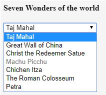
<h4>Seven Wonders of the world</h4>
<form>
<select name = "dropdown">
<option value = "taj" selected>Taj Mahal</option>
<option value = "china">Great Wall of China</option>
<option value = "chirst" required>Christ the Redeemer Satue</option>
<option value = "machu" disabled>Machu Picchu</option>
<option value = "chichen">Chichen Itza</option>
<option value = "colossem">The Roman Colosseum</option>
<option value = "petra">Petra</option>
</select>
</form>
</body>
The above example contains different options like disabled, selected, required, etc., which is shown in the output screen.
Output:
Example #2
Code:
<html>
<body>
<form id="dropdowndemo">
<select id="multiselectdd">
<option>Mumbai</option>
<option>Pune</option>
<option>Nagpur</option>
<option>Solapur</option>
<option>Latur</option>
</select>
<input type="button" onclick="multipleFunc()" value="Select multiple options">
</form>
<p>Multiple options can be selected here .Please press ctrl key and select multiple options at a time. </p>
<script>
function multipleFunc() {
document.getElementById("multiselectdd").multiple = true;
}
</script>
</body>
</html>
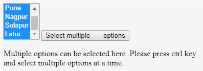
As shown in the below screenshot, select multiple options from the dropdown list, press the given button and select multiple options by pressing on CTRL.
Output:
Example #3
Code:
<!DOCTYPE html>
<html>
<head>
<style>
.dropdownbtn {
background-color: black;
color: white;
padding: 12px;
font-size: 12px;
}
.dropdowndemo{
position:fixed;
display: block;
}
.dropdownlist-content {
display: none;
position: absolute;
background-color: greenyellow;
min-width: 120px;
z-index: 1;
}
.dropdownlist-content a {
color: darkblue;
padding: 14px 18px;
display: block;
}
.dropdownlist-content a:hover {background-color: lightcyan;}
.dropdowndemo:hover .dropdownlist-content {display: block;}
.dropdowndemo:hover .dropdownbtn {background-color: blue;}
</style>
</head>
<body>
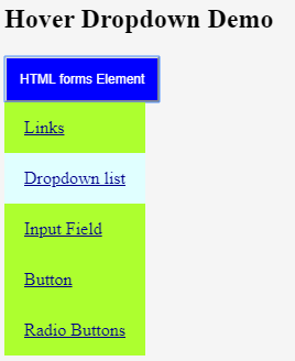
<h2>Hover Dropdown Demo</h2>
<div class="dropdowndemo">
<button class="dropdownbtn">HTML forms Element</button>
<div class="dropdownlist-content">
<a href="#">Links</a>
<a href="#">Dropdown list</a>
<a href="#">Input Field</a>
<a href="#">Button</a>
<a href="#">Radio Buttons</a>
</div>
</div>
</body>
</html>
The dropdown list will be open on the hover effect.
Output:
Conclusion
We can conclude that the Dropdown list is used to select an option from the selection list. It is used to select single or multiple options at a time. Users can select an option from the list as per their choice, so it becomes more user-friendly. Attributes listed above is used with the select tags to do various selection operations with the Dropdown list.
Recommended Article
This is a guide to Dropdown List in HTML. Here we discuss how Dropdown List Work in HTML and its Examples with Code Implementation. You can also go through our other related articles to learn more –